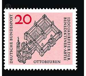
1200 years of the Ottobeuren Benedictine Abbey - Germany / Federal Republic of Germany 1964 - 20
| Country | Germany / Federal Republic of Germany |
| Issue Date | 1964 |
| Face Value | 20.00 |
| Color | orange red |
| Perforation | K 14 |
| Printing Type | Single-color offset printing and 2-color Typography |
| Stamp Type | Postage stamp |
| Item Type | Stamp |
| Chronological Issue Number | 318 |
| Michel ID | BRD 428 |
| Chronological Chapter | GER-BRD |
| SID | 428495 |
| In 62 Wishlists | |
The Benedictine Abbey of Ottobeuren celebrates its 12th anniversary in 1964. With the issue of the stamp not only the venerable ecclesiastical institution as such is considered for its importance and its old age, but at the same time also for her a millennium younger housing, one of the greatest Baroque plants on German soil and thus a cultural and art historical work of high rank. Considering this, the abbot of the monastery expressed the wish that the essential contents of the brand would be the remains of the monastery, which are still intact and intact, according to a historical account. The graphic artists invited to work on the designs received the engraved stone engraving reproduced on page 4 of this sheet, the inscription of which by the way points exactly to the age of the monastery with the words: "Outline of the Immediaten Freyen Reichs Stüffts u Ottobeyren O. S. Bened. in Swabia was so anno 764 stoned ". Herbert Lemkes delivered one, Professor Eduard Ege two designs. Nikolaus Müller and Herbert Kern each received three solutions and Reinhart Heinsdorff five solutions. The market town Ottobeuren presented without request five proposals of the Munich picture maker Karl Roth. Of these nineteen drafts, fourteen follow the suggestions given, while the other five try to find a viable solution with crests, putti, angels, or saints. Having gained the first cursory overview, it has already been shown that the nature of the gigantic building complex can only be grasped in terms of both its outward appearance and its spiritual conception with a strict architectural representation. It requires clever moderation in order not to perish in too much of the forms or to succumb to the tendency to playfulness. Only those who master the art of omission have been able to cope with this extraordinarily difficult and delicate task. Prof. Eduard Ege summarizes the central building complex of the monastery district and the church into a streamlined and powerful line structure and, as the only one of the participating artists, refrains from highlighting individual areas within this drawing by means of black. In this way, a gray effect results, which combines with the text lines and the numeral value to a uniform structure of absolutely brand-like nature. As a generally valid rule for the art of the brand, it can be convincingly deduced from this example that one can not transfer a product of graphic art to the stamp without any modification. In order to gain the right scale, it must rather be covered, circumcised, balanced, and everything put in a good relationship. The Federal Minister of Posts and Telecommunications has approved the proposal of the Art Advisory Council, whereupon the brand has been executed in the Bundesdruckerei Berlin. On the pink offset printing, the drawing and the text in black and the value in red were set in two-color intaglio printing.
| Condition | Name | In Stock | Price | Price + Shipping | Store | |
|---|---|---|---|---|---|---|
 | Used | 1200 years of the Ottobeuren Benedictine Abbey - Germany / Federal Republic of Germany 1964 - 20 | 20 | US $0.213 | US $3.40 |  FILATELIELOKET (0) FILATELIELOKET (0)Shipping US $3.19 Minimum Order US $2.66 |
 | Unmounted Mint ** | 1200 years of the Ottobeuren Benedictine Abbey - Germany / Federal Republic of Germany 1964 - 20 | 10 | US $0.32 | US $3.50 |  FILATELIELOKET (0) FILATELIELOKET (0)Shipping US $3.19 Minimum Order US $2.66 |


