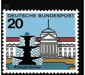
Capital cities of the Federal Republic of Germany - Germany / Federal Republic of Germany 1964 - 20
Theme: Architecture
| Country | Germany / Federal Republic of Germany |
| Issue Date | 1964 |
| Face Value | 20.00 |
| Color | multi-colored |
| Perforation | K 13 1/4: 13 |
| Printing Type | Multicolor offset printing |
| Stamp Type | Postage stamp |
| Item Type | Stamp |
| Chronological Issue Number | 310 |
| Chronological Chapter | GER-BRD |
| SID | 492936 |
| In 76 Wishlists | |
This series is intended to familiarize the general public with the capitals of the German federal states in typical views. At the same time, some values are linked to important events and facts. Thus the mark for Hamburg reminds of the fact that the harbor of this cosmopolitan city exists since 775 years, while the Munich mark appreciates the reconstruction of the destroyed in the war Bavarian national theater, which was handed over on 23 November 1963 of its destination. First of all, it was discussed in agreement with the participating cities which objects should be regarded as the essential core of the urban structure concerned. At the same time, it was important to consider whether the buildings, squares or neighborhoods considered are suitable for a true-to-the-style rendition of the mark and, in any case, that they maintain a consistent standard. In fact, one essential requirement was that the extensive series of eleven values, despite the diversity of the given cityscapes, ultimately had to assert itself as a unified whole. For experimental purposes, seven graphic artists were commissioned to draw up draft sketches for the three cities of Hamburg, Kiel and Wiesbaden. The best result of this tender would then indicate which artist was to be conveniently entrusted with the design of the entire series. The graphic artists Heinz and Hella Schillinger, Nikolaus Müller, Gustaf Nils Dorén, Hans Schweed and Hermann Bentele each sent three designs. Leopold Nettelhorst received four solutions, Hans Kuh eight. The City of Hamburg unsolicitedly provided five suggestions from Prof. Erwin Krubek, which could not be easily compared with the results of the competition, because they were limited to motifs of a single city, ie they did not address the actual problem of the task, namely the many possibilities who were to bring on a formal general denominator. It is probably no coincidence that two graphic artists tried to do justice to the task by offering city arms. To be sure, the solutions developed by Hermann Bentele are excellent examples of such a type of brand. However, it becomes obvious how much the transition to heraldry means at the same time evading a more comfortable track. Because the problem of how a cityscape or an architecture can be shown on the small brand area without falling into the usual genre of the view postcard, proves to be extremely difficult to solve. Only graphic designer couple Heinz and Hella Schillinger managed to cope with the difficulties in a convincing way at the first attempt. The two artists make use of a strongly held contour drawing and a tightly structured surface and thus arrive at a stylization that is precise in their individual forms and distinctive in expression. Not romantic, atmospheric pictures are offered, but the atmosphere of the city is brought to life without effort. And yet, despite all the sharpness and harshness of the formulations above this series of brands, there is a touch of poetry that nobody can escape. The Federal Minister of Posts and Telecommunications has responded to the proposal of the Art Advisory Council to commission the graphic artists Heinz and Hella Schillinger with the processing of the entire series. The stamps were produced in multi-color offset printing by the Bundesdruckerei Berlin, with the exception of the two brands Wiesbaden and Düsseldorf, which were produced in the graphic arts firm A. Bagel in Düsseldorf.


