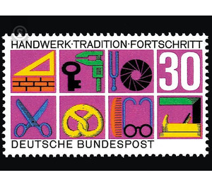
craft - Germany / Federal Republic of Germany 1968 - 30 Pfennig
Theme: Art & Culture
| Country | Germany / Federal Republic of Germany |
| Issue Date | 1968 |
| Face Value | 30.00 |
| Color | multi-colored violet |
| Perforation | K 14 |
| Printing Type | Six-color offset printing |
| Stamp Type | Postage stamp |
| Item Type | Stamp |
| Chronological Issue Number | 443 |
| Chronological Chapter | GER-BRD |
| SID | 945514 |
| In 68 Wishlists | |
What handicraft for humanity today means in the age of technology and industrialization and the use of computers is generally considered too little. These are important issues that touch not only the personal well-being of the individual, but also the districts of business, commerce and culture. So it is to be understood, if the German Federal Post Office has issued for a historical or other reason a long-hand and very carefully prepared special postage stamp for the honor of the craft. This brand should be a reminder and a call at the same time - a call that urged a broad public to heart: Take the preservation, promotion and careful care of a healthy craft and with all the resources and forces at your command; because it would be impossible to tell how deep our attitude of life and our sense of life could sink if there were no more craft. There are seven different branches, into which the artisan professions are divided. Initially, the intention was to devote a separate brand to each of these parts. For experimental purposes, a number of artists have been invited to come up with proposals for the fields of construction, woodcraft and food industry. After this call, Hans Förtsch and Sigrid von Baumgarten, Hermann Bentele, Prof. Karl Oskar Blase, Prof. Eduard Ege, the couple Hella and Heinz Schillinger as well as Eugen Nerdinger and Karl Bedall each received three designs. The latter converted his woodcuts again in such a way that he doused them with colored bases. Eduard J. Sauer provided a variant of his three works, and Reinhart Heinsdorff dealt in a dozen sketches particularly thoroughly with the overall theme. 57 individual sheets were to be judged. Out of this abundance, Prof. Eduard Ege's proposals stood out as agreeable combinations of the most varied individual elements, while the very colored sheets of Prof. Karl Oskar Blase were pleased because the motley modernity found a symbolic complement in the woodcut-like treatment of the drawing. which, as will be seen later, bore beautiful fruit. But first and foremost, the signs built on an astonishingly thin leg of a skull, which had been suggested by the couple Hans Förtsch and Sigrid von Baumgarten. The square, made up of mighty lines, which acts as a bearer of symbol and inscription, promised an effect of extraordinary suggestion. However, in the ensuing discussions, doubts have arisen as to whether the attempts begun with the three most prolific craft groups can really continue so successfully across the entire series of brands, whether stylistic cliffs will emerge, as it does, as reluctant areas as those of the car mechanic, Dentist, the manufacturer of prostheses of all kinds graphically-artistically fix. But also considerations in sociological and economic direction led to the realization that it would be better to build on a different basis. Although craftsmanship, with its proverbial golden soil, has a venerable tradition going back a long way, it was important for her to emphasize that the future belongs to him as well. In a second call for tenders, these two poles should be combined into one coherent unit on a single label. Prof. Karl Oskar Blase, Prof. Eduard Ege and Friedrich Poppel each sent a suggestion. Prof. Hans Michel translated his theme into three variants, which can not be shown here. They are not changed in the drawing, but arise only from the fact that positive and negative, black and gray are compared. Herbert Kern, Siegfried Kortemeier and Erwin Poell each received two works, Walter Tafelmaier four designs. Prof. Karl Oskar Blase developed his above-mentioned solutions from the first call for tenders to a rectangle composed of eight square fields. A Gefach is filled with the juicy value held; in the remaining seven all craft groups could be hinted at. This is done on reddish-violet ground in such bright colors that it recalls the latest insights of our most recent generations of artists and makes the mark with its colorfulness quite contemporary and contemporary, while the drawing with its antiquing horizontal gridding refers back to early times. The theme of »tradition and progress« sounds meaningful and witty in the chosen graphical form. The very independent and peculiar brand in its whole way of thinking and attitude acts like an open picture book. It sets the tone exactly according to its content.


